Accounting for empty homes

The topic of empty homes attracts quite a lot of attention in England, given what seems to be a severe shortage of available housing. But surprisingly little is known about the reasons why homes may be standing empty, and how many are really available for a household to rent or buy.

The first point to cover is the overall rate of vacant homes (I’ll use ‘vacant’ from now on as that’s the term more commonly employed in official statistics). The OECD publishes the chart below as part of its Affordable Housing Database, showing the UK (actually England) with a very low rate of vacant homes, just 2.7% of the total. This is based on Council Tax data, which the OECD says is closest to the definition used in other member countries.

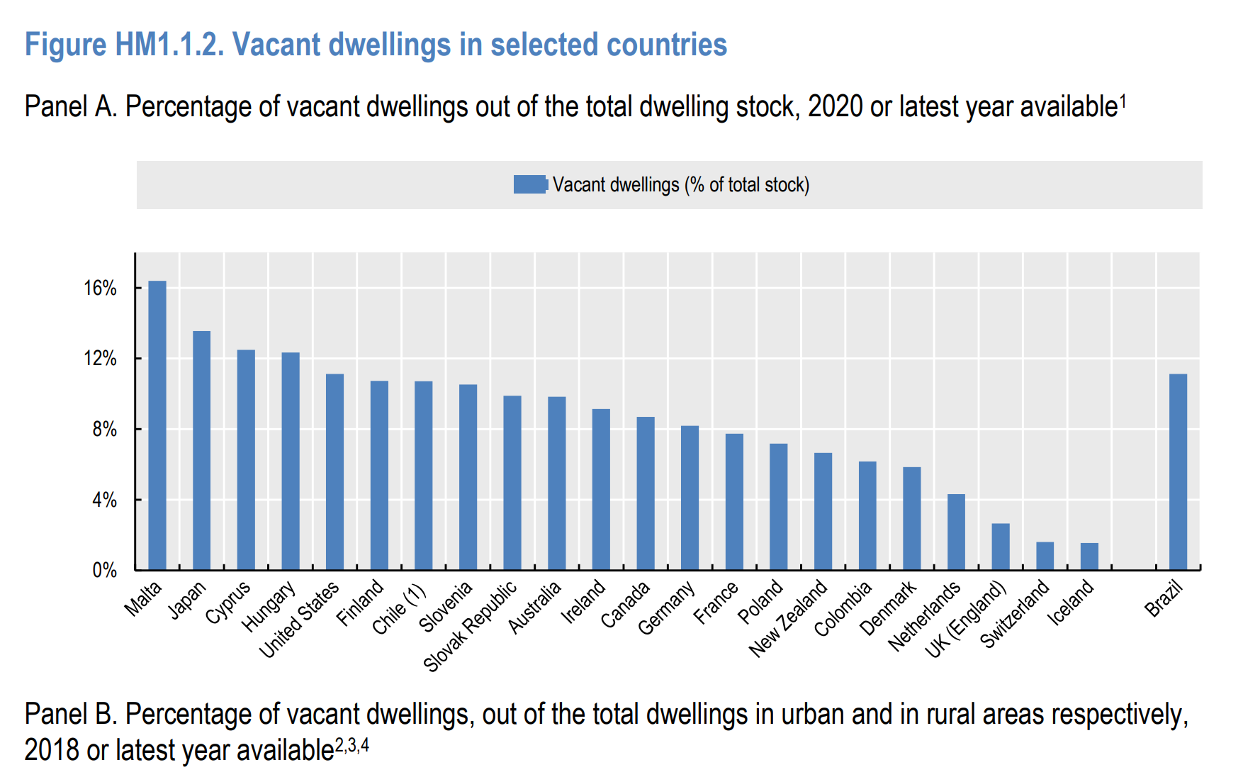
That may be so, but the UK/England figure is too low as a comprehensive estimate of vacant homes, because not every vacant property owner will go to the trouble of registering it as such. It’s not clear to what extent this same issue applies to other countries, but for now it is worth just noting the OECD average of 8.1% vacant homes (excluding Malta due to its size).

Instead of Council Tax data I’m going to use survey data in this post. The English Housing Survey (EHS) is the best available as it is set up for exactly this kind of question. It is still not perfect however, as it only covers England, it doesn’t count second homes in the dwellings total and the sample size is not huge. There is also the Census, but even in normal times its figures on vacant homes (sorry, ‘household spaces with no usual residents’) are not very clear, and the 2021 Census was taken at the distinctly abnormal mid-pandemic time of March 2021 so probably doesn’t tell us very much about vacant homes either side of the pandemic period.

For this post I have analysed EHS microdata, combining the 2017 and 2019 datasets to allow for a large enough sample for disaggregation, so I’ll refer to the resulting figures as a 2018 average. It’s worth noting that the coronavirus pandemic severely disrupted the EHS fieldwork and restricted its surveyors to assessing homes from the outside rather than carrying out physical inspections, so data on vacant homes for 2020 to 2022 is either not available at all or considered less reliable than the pre-pandemic period.

According to the EHS there were 1.1 million vacant homes in England in 2018, equivalent to 4.6% of the stock. This is higher than the 2.7% Council Tax figure reported by the OECD but is still lower than the figures reported by the OECD for every other country except the Netherlands, Switzerland and Iceland.

The overall rate of vacant homes in England hasn’t changed very much over the last few decades: it was 3.9% in 1996 (the earliest figure I can find, from the 1996 English House Condition Survey) and has hovered around 4.5% since 2009.

The figure should actually be lower than 4.6%, because the EHS doesn’t include second homes in its figure for the total dwelling stock. But the rate of second home ownership in England is low enough (around 4%, as discussed in a previous post) that I haven’t made any adjustment for it.

The EHS surveyors attempt to find out how long vacant homes have been vacant for, but are not always successful. In 2018 they reported 390,000 short-term vacants , dwellings that had been vacant for less than six months (1.6% of the total dwelling stock), and 430,000 that were long-term vacant for six months or more (1.8% of the stock). Another 1.2% had been vacant for some indeterminate amount of time.

The number of homes recorded as long-term vacant has increased slightly over the last decade (from around 400,000 in 2009 and 2011). One potential explanation comes from official statistics on Council Tax showing that the number of “Dwellings left empty by deceased persons” in England rose from 72,000 in 2012 to 122,000 in 2022, with statisticians attributing some of this increase to delays in probate. Now, whether these kinds of vacant homes are counted in the EHS as short-term or long-term doesn’t really matter – the point is they are being held off the market so aren’t available for someone else to move into, although if the delays get sorted their number should reduce again.

However, even short-term vacant homes may not actually be available to someone looking for a home, for example if they have already been sold or rented and are awaiting their new occupants moving in. The EHS says there are around 300,000 in England (slightly under half of which are awaiting owner occupants rather than tenants). This category of vacant homes is an important form of what are sometimes called ‘frictional’ vacancies – a baseline rate of empty properties that is always required to allow for mobility between homes, much like a healthy labour market requires a baseline rate of job vacancies.

There are other reasons why vacant homes may not be available for anyone to move into. Around 180,000 homes are estimated by the EHS to be vacant due to ongoing renovation or modernisation works, while around 20,000 (a very rough estimate, given the small number of survey cases involved) are considered derelict or are awaiting demolition.

There is a small amount of overlap between all these categories, but we can use them to construct a very rough estimate of how many vacant homes are not included in any of them and can therefore be considered available to rent or buy, at least in principle. According to my calculations there were around 630,000 ‘available’ homes in this sense in 2018 (2.6% of the total stock). How many of these are actually on the market is not something that the EHS data can tell us because the list of criteria I’ve used to calculate the figure is so narrow – not including, for example, those homes that are vacant and subject to probate.

So far I haven’t taken any account of the condition of vacant homes, except to the extent that EHS surveyors recorded them as derelict or undergoing modernisation. But there are other forms of poor housing conditions recorded by the EHS, which if they occur at a higher rate in vacant homes may indicate a need for investment before the home is put back on the market – or a home in such poor condition that there is very little demand for it.

The headline measure of dwelling condition used by the EHS is the Decent Homes Standard, which assesses homes on four criteria concerning health hazards, state of repair, thermal comfort and the condition and age of its facilities. 17% of occupied homes in 2018 fell below the Standard, but this figure rose to around 24% for short-term vacant homes and around 36% for those vacant for 6 months or more. 10% of occupied homes were assessed as containing at least one of the most serious (‘category 1’) health hazards, compared to around 11% of short-term vacant homes and around 22% of long-term vacants.

An estimated 4% of occupied homes had a damp problem in one more rooms in 2018, compared to 2% of short-term vacants and 6% of long-term vacants. Relatedly, the proportion of long-term vacant homes with poor energy efficiency was also much higher: 35% were assessed to be in band E or below, compared to 15% of short-term vacants and 16% of occupied homes.

The pattern here is fairly clear, and unsurprising: homes that are in poor condition are more likely to be long-term vacant. Perhaps this is as it should be, so long as they remain in that state: don’t forget that there are large numbers of homes in poor conditions – 2.4 million with serious health hazards, for example, and 800,000 with damp – that are occupied because their residents don’t have better choices available.

What effect does this analysis of conditions have on our overall figures? Again there are some overlaps between categories to deal with, and in total there are around 420,000 vacant homes that either fail the Decent Homes Standard, have a damp problem, have low (band E to G) energy efficiency or have substantial ‘basic’ repair costs (defined as more than £35 a square metre in line with EHS practice). This figure includes around a third of the vacant homes previously categorised as ‘available’, leaving around 410,000 homes (1.7% of the total stock) that are vacant, ‘available’ and not in a poor condition.

In summary, I think the key points are:
– The rate of vacant homes in England is higher than indicated by Council Tax data, but still lower than the rates reported by most other OECD countries;
– A significant proportion of vacant homes aren’t available for households to buy or rent, because they’re already awaiting occupants, they’re undergoing works, they’re held up in probate or some other reason;
– A further significant proportion are in notably poor condition, which may mean they haven’t been put on the market by their owners or they aren’t attracting any interested occupants.

How do multiple home ownership rates in Britain compare to the rest of Europe?

How do rates of multiple property ownership in Britain compare to the rest of Europe? I’m not aware of any perfectly comparable datasets, so this thread looks at a few different sources. I’ll compare both a wide definition of multiple property ownership, which includes properties rented out to other households, and a narrower ‘second home’ definition that includes additional properties that households keep for their own use.

The first source is a 2019 academic article by Barend Wind and others on multiple property ownership across Europe. The authors use data from the Household Finance and Consumption Survey carried out in most European countries (but excluding the UK) in 2014 and 2015. Their chart copied below shows the proportions of households in 20 EU countries that owned more than one residential property in 2014-15, ranging from 4% of households in the Netherlands to 27% in Estonia, with a median of 14.5%.

Chart showing multiple property ownership rates in 20 European (EU) countries in 2014-15.

For the UK, there are a few different data sources:

  • This blog from Laura Gardiner at the Resolution Foundation, using a mix of data sources up to 2012-14
  • ONS data on ‘ownership of other property’ from the Wealth and Assets Survey covering 2006 to 2020
  • English Housing Survey data on second home ownership in 2008-09 and 2018-19.

According to the ONS, no more than 9% of British households owned additional residential properties in the UK in 2014 to 2016. I say ‘no more than 9%’ because 4% owned second homes and 5% owned ‘Buy to lets’ (though presumably not all with an actual Buy to Let mortgage), but there is an unknown amount of overlap between the two categories. Up to another 3% owned ‘land or property’ overseas. By 2018-20 the ONS figure had not changed and still stood at 9%.

These figures are broadly in line with Gardiner’s estimate that 10% of adults in 2012-14 were in families that own multiple properties.

Meanwhile the English Housing Survey reported that in 2018/19 2.44 million English households reported owning multiple properties (some of which were outside the UK), equivalent to 10% of all households. So from these sources it seems around 10% of households in the UK own multiple properties, which would be below the European average.

Gardiner estimates that the value of additional properties accounts for around 15% of total property value (disregarding mortgage debt). The European figures, taking mortgage debt into account, indicate that additional properties typically account for significantly more than 15% of total property wealth. Again this comparison suggests a lower rate of multiple property ownership in the UK than the European average.

The article by Wind et al goes on to consider what it calls ‘landlordism’, which is when a household with additional properties draws rental income from one or more of them. Germany has the highest proportion of landlordism among households with multiple properties (at nearly 80%), followed by Ireland at around 65%. The European average is around 45%.

Chart showing rates of secondary property ownership and landlordism in 20 European Union countries.

The ONS Wealth and Assets Survey data mentioned above reports that, at around the same time as the European survey was carried out, 5.2% of households in Britain owned a ‘buy to let’ rental (again, this seems to include homes that aren’t actually owned with a BTL mortgage) while 4.0% owned a second home that wasn’t rented out. That works out at a ‘landlordism’ rate of 60%, above the European average. Again, the ONS figures hadn’t changed much as of the latest data (2018-20).

The English Housing Survey data indicates that 2,675,000 (71%) of the 3,753,000 additional properties reported by households in England in 2018/19 were rented out. This is not out of line with the landlordism figure from the Wealth and Assets Survey when you consider that households are more likely to own multiple ‘buy to let’ properties than multiple second homes for their own use.

Based on these figures, I’ve added a point for where I think Britain/the UK sits to the EU chart.

Chart showing rates of secondary property ownership and landlordism in 20 European Union countries, plus estimate for UK

Although the rate of ‘landlordism’ seems to be higher in Britain than the European average, the proportion of all households that own rental property may not be, because of Britain’s lower overall rate of multiple property ownership. If 10% of British households own multiple properties and 60% of them own rental property, then 6% of all households own rental property. This is below the figure in France, where 18% of households own additional property of whom around 50% rent property out.

The second point is that a higher rate of ‘landlordism’ among multiple property owners equates to a lower rate of ownership of second homes for the household’s own use. Taking the same figures again, it looks like around 4% of British households own second homes for their own use, compared to around 9% in France. Across Europe as a whole it looks like only Ireland and Germany have lower rates than Britain of ownership of second homes for the household’s own use.

Pushing together and pulling apart: regional divergence in the long run

Paul Krugman recently published a short paper about growing economic disparities betweeen US regions, arguing that this constitutes a ‘third great transition’ after an urbanisation trend that lasted until around 1920 and a suburbanisation trend that lasted until around 1980.

In this blog post I set out some corroborating evidence that shows similar trends in the UK, show a new way to visualise aggregate population distribution trends, and suggest some implications for the way we think about urban change.

Krugman summarises his paper as follows:

Basically, I want to make three points:
1. The regional divergence we’ve seen since around 1980 probably isn’t trivial or transient. Instead, it reflects a shift in the underlying logic of regional growth — the kind of shift that theories of economic geography predict will happen now and then, when the balance between forces of agglomeration and those of dispersion crosses a tipping point.
2. This isn’t the first time this kind of transition has happened. In fact, it’s the third such shift in the history of the U.S. economy, which went through earlier eras of both regional divergence and regional convergence.
3. There are pretty good although not ironclad arguments for “place-based” policies to limit regional divergence. It’s important to realize, however, that the U.S. system already provides huge de facto subsidies to lagging regions. The fact that we’re diverging anyway suggests that the economic forces at work are quite powerful.

I think each of these points applies to the UK too, which helps both to reinforce Krugman’s argument and to cast some light on causes of regional divergence in the UK that go beyond the usual narratives.

Krugman starts his new paper with a look back to an old one, 1991’s influential “Increasing returns and economic geography“. That paper presented a simple model of regions where firms are assumed to produce either agricultural or manufacturing goods. Because of its economies of scale, manufacturing production will tend to be concentrated in a limited number of areas, which due to transportation costs will usually be closer to centres of demand, i.e. towns and cities. But given that manufacturing workers themselves will add to the population of those areas and create extra demand, you get a process of cumulative causation or reinforcing urbanisation as workplaces locate near people who locate near workplaces. In very simple terms this is how we got industrial cities.

Krugman’s paper shows that these reinforcing processes are fundamentally non-linear , can be triggered by relatively small changes in causal variables and can produce quite different outcomes depending on the interaction of a few important factors. The most important of these factors are the extent of economies of scale in different types of work and the level of transport costs. If economies of scale were low and transport costs high, for example (basically a pre-industrial world), then both workplaces and population would be relatively dispersed, as most people would live in relatively small communities and buy locally produced goods.

So you need some reduction in transport costs to allow production to cluster and cities to form. But what if transport costs fall even further? Railways, for example, slashed the cost of moving goods and people from one station on the network to another, but not the cost of moving stuff off the network. That had to wait for the rise of motor vehicles, which allowed both people and production to spread out along a vast and far more intricate road network. During this new phase, cities generally grew larger but less dense, with city centre populations often declining and suburban ones booming. Some cities, especially those most reliant on particular manufacturing industries, shrank in absolute terms as those industries either moved to cheaper locations or disappeared altogether.

What Krugman highlights in his latest paper is that these trends of urban growth and decline are a major driver of changing regional inequalities. Put simply, forces that push people together in cities tend to pull regions apart in terms of economic outcomes. While the industrialisation phase had been marked by increasingly sharp contrasts between regions and between city and country (as noted by many observers including Engels in The Housing Question), the second phase involved a re-convergence, as the boundaries between city and country became blurred and suburban sprawl became the dominant form of growth (the narrowing of regional inequalities was therefore inextricably linked to the rise of cars and trucks).

Krugman presents various charts that illustrate this, with richer regions of the United States pulling away between the 19th and early 20th centuries, poorer regions catching up somewhat between the 1920s and 1970s, and either stalled convergence or even renewed divergence since then. The chart below is one example, and shows the ratio of output per worker in the early-industrialising New England region and the relatively rural East South Central region, from estimates by Baier at al. Note, for clarity when compared to the other charts in this post I’ve flipped the ratio from the one used by Krugman in his paper.

US regional inequality chart

You see a broadly similar pattern if you look at data for the UK. For example, this chart, made by combining estimates from Nicholas Crafts and Ron Martin, shows the inequality in regional GDP per capita in Britain / the UK (measured by the coefficient of variation) between the 1870s and the 2010s. By this measure, regional inequality peaked in the early 1900s but had fallen sharply by the 1970s. But just as in Krugman’s US chart, inequality between regions then rises again towards the end of the century (and into the new one at an accelerating pace, in the UK data).

Regional GDP inequality chart

The explanation for this resurgence in regional inequality (which seems to be stronger in the UK than in the US) is not that we’ve re-industrialised but that forces of economic concentration are once again in the ascendant. Just as in the industrialisation phase, various factors bundled up in the concept of ‘agglomeration’ (economies of urban scale) are important here. Cities are fundamentally good places for learning,  for copying or indeed for stealing the ideas of others, and when knowledge-intensive services are the fastest growing sectors in the economy then firms and workers are both more willing to locate in cities even if they have to pay a premium.

The agglomeration explanation is consistent with Krugman’s story of returns to scale. But he’s the first to admit that his model is a simplification, and one important thing it leaves out is the role of quality of life in cities, or urban amenities to use the term from economics. Industrialisation and rapid urbanisation exacted some serious tolls on quality of life (and indeed length of life) in cities via pollution, disease and crime, to the extent that there was a large urban mortality penalty around the end of the 19th century. The dangers of urban life meant that as soon as people were able to move out of cities and still access good jobs they did so in large numbers, fuelling the outward movement of both population and employment in the suburbanisation phase described above.

But many of these urban malaises have been addressed by improved technology or policy. The infant mortality rate in London is now below the national rate, crime rates in US cities have fallen faster than in the suburbs (and New York City now has a lower murder rate than the US as a whole, for example), larger cities have generally made faster advances in terms of quality of life than smaller ones or rural areas, and in the US at least there has been a growing rural mortality penalty since the late 1980s. All these changes have made cities more attractive places to live, contributing to the agglomeration effects that push up city incomes relative to other areas.

It’s important to consider quality of life because the rise of cities in the 19th century and the rise of suburbs after WW2 was not just a story of where work happened but of where people lived. These two phases left many cities that had thrived during industrialisation with large swathes of depopulated, dilapidated or even abandoned neighbourhoods, while creating vast and largely car-dependent suburbs in the US, UK and many other countries.

It’s difficult to summarise these population trends, which are the sum of huge changes in births, deaths and migration, but one way of doing so is by looking at changes in average ‘lived density’ over time, where lived density is defined as the average population density of a country when divided into neighbourhoods or some other small area and where each of those areas is weighted by its population. That’s a mouthful, but it basically means that this measure tells you what the most typical neighbourhood density of a country is, and as long as your definition of neighbourhoods is fairly stable over time it gives a useful indication of whether a country’s population is becoming more or less concentrated. The first chart below shows what this looks like for counties in the US, using Jonathan Schroeder’s estimates of county population densities up to 2010 and my calculations for 2017.

US weighted average population density

The second chart below shows the trend in average lived density for England and Wales, this time using data on local authority populations from the Vision of Britain historical GIS. I’ve suggested dividing it into three periods – urbanisation, suburbanisation and re-urbanisation. So far the re-urbanisation process has not brought us back to the densities of the early 20th century, and the restrictions on densifying housing in our existing urban neighbourhoods mean we are unlikely to get there.

England and Wales weighted average population density

Please note that the scales used in these two charts are very different – the US chart uses people per square mile at county level, while the England and Wales chart uses people per hectare at local authority level. But the important thing in each case is the trend, and these look quite similar to each other, and also to the trends in economic concentration shown earlier in this post.

The lesson, I think, is that the resurgence of cities in Britain, the US and elsewhere is a predictable consequence of the disproportionate growth of economic sectors that experience increasing returns to urban scale, as well as improvements in urban amenities (and continued stagnation in transport technologies). It’s not really a result of conscious policy choices, at least not ones that were made with this end in mind – in fact, the balance of policy in most countries is quite anti-urban, in so far as it supports cars over public transport, owner occupation over renting and low-density housing over apartments.

The implication, supported by divergence in land and house prices between urban and suburban areas, is that there is massive latent and frustrated demand to live in urban areas. Given the very different environmental footprint of urban versus non-urban lifestyles, this seems like quite a large missed opportunity.

Acknowledgement for use of Vision of Britain data: This work is based in part on data provided through http://www.VisionofBritain.org.uk and uses statistical material which is copyright of the Great Britain Historical GIS Project, Humphrey Southall and the University of Portsmouth. Parts of the data are Crown copyright, adapted from data from the Office for National Statistics and licensed under the Open Government Licence v.1.0. Parts are based on historical material which has been re-districted by the Linking Censuses through Time system, created as part of ESRC Award H507255151 by Danny Dorling, David Martin and Richard Mitchell.

The trouble with Ribbles – why ‘average happiness’ estimates in sparsely populated places don’t mean very much

Various media including The Guardian reported this week on data released by ONS showing that Ribble Valley was “officially” the happiest place in the UK in 2018/19. Looking through the data though, I noticed that the neighbouring local authority of South Ribble had one of the lowest levels of self-reported happiness in the country (an average of 7.02 out of 10, compared to 8.30 in Ribble Valley).

Now I’m not familiar with these places and maybe they’re very different, but ONS helpfully provide an interactive tool that allows you to track reported happiness levels for individual local authorities over time. Select the two Ribbles and this is what you get:

Ribbles

At first glance this looks pretty strange. It seems like people in South Ribble became much happier between 2013/14 and 2014/15, while their neighbours in Ribble Valley slumped into a collective depression between 2014/15 and 2015/16. In 2017/18 they were pretty close in terms of reported happiness, but in the last year they have diverged massively. Either there’s something in the waters of the Ribble that causes volatile mood swings, or there’s something else going on.

That something else is simply the variability that you get when surveying small samples of people. Both Ribbles are relatively rural local authorities with relatively small populations – indeed, Ribble Valley has one of the smallest populations in England. The happiness data is taken from the Annual Population Survey, which interviews a roughly random sample of people every year, resulting in a far larger sample in places like Birmingham (where there were 990 interviews in 2018/19) than in places like Ribble Valley (where there were just 60, the joint lowest in the UK). When you plot sample size against average reported happiness you get this:

Happiness_and_sample_size_ONS

The vast majority of the variation in reported happiness is found in local authorities where there very few people interviewed, which is exactly what you would expect to happen due to sampling variability alone. Most of this variation is completely spurious: in fact going by ONS’s own published confidence intervals there are dozens of local authorities in the UK whose reported average levels of happiness are not significantly different from Ribble Valley’s.

This affects authorities at the other end too – in the chart above I’ve picked out Surrey Heath, which by these numbers is the unhappiest place in the country. But in 2017/18 it was one of the happiest. What changed? Perhaps not very much – in both years the estimates were based on just 80 interviews, and the confidence intervals of the estimates overlap.

It’s particularly poor of the Guardian to make this mistake, because Ben Goldacre wrote about it eight years ago in his ‘Bad Science’ column, including this chart on local bowel cancer mortality rates that looks rather similar to the one above.

bowel-cancer-mortality-ra-007

Is there any basis to the idea that places like Ribble Valley are happier? Probably a bit – ONS note that it and other rural areas with beautiful landscapes consistently appear towards the top of its rankings. And looking across all rural and urban areas, country dwellers tend to report slightly higher levels of happiness and satisfaction than those in cities. But if you’re going to try and measure something like happiness in sparsely populated areas you really need to either massively increase the number of people you interview (which would be very expensive) or abandon the idea of annually changing estimates and pool your findings across several years. ONS do just this for other things they report on – why they don’t bother for these figures is a bit of a mystery.

Do financialisation and constrained land supply mean house prices have to rise?

If land prices determine house prices, and if land is fixed in supply, then rises in demand for housing feed straight into higher housing costs. That’s the argument of ‘Why can’t you afford a home?‘ by Josh Ryan-Collins, which as both he and Chris Dillow note is in many ways a return to the classical economics of David Ricardo.

What everyone knows about land is that (with a few exceptions like Singapore and the Netherlands) you can’t make any more of it, so Ryan-Collins argues that “If demand for land increases, the price goes up without triggering a supply response. All else being equal, this means any increase in the demand for land will only be reflected in an increase in its price, not its quantity”.

I think it’s more accurate to say that while the total amount of land may be fixed, the amount of developable land is not, and its supply can and does change in response to demand, as long as it’s allowed to. Transport is a key factor here – the revolutionary changes in transport technologies between the mid-19th and mid-20th centuries enabled vast swathes of previously agricultural land to be developed, something which helped hold down housing costs, reduced urban overcrowding and vastly improved housing conditions (a process, incidentally, that was celebrated and encouraged by Charles Booth in his 1901 pamphlet ‘Improved means of locomotion as a first step towards the cure of the housing difficulties of London‘).

But for the time being we have run out of transport revolutions – in fact the average speed of travel in England has been broadly static since the late 1980s, as my chart below from National Travel Survey data shows.

Average travel speed

As a result of this stagnation in transport and some policy-imposed restrictions such as England’s Green Belts, the supply of developable land has become more fixed. But what’s pushing up demand? As Ryan-Collins sees it, the key factor is ‘financialisation’, which broadly speaking means increases in mortgage credit supply due to policy-driven liberalisation and deregulation. He writes: “Banking systems … have become primarily real estate lenders, creating credit and money that flows into an existing and fixed supply of land. This pushes up house prices.”

How much of an impact does financialisation have? Ryan-Collins cites an OECD study which found that over recent decades financial deregulation has increased real house prices by as much as 30% in the average OECD country.

But hang on: the same study also found that the impact of financial deregulation varies widely and “is smaller in countries where housing supply is more responsive”. The below chart (figure 6 from the OECD paper) shows that for a country where housing supply increases more in response to rising demand (to be exact, where the responsiveness of housing supply is less rigid by 0.5 standard deviations) the effect on prices is only around 12%, while at the other end of the scale the impact on prices is nearly 50% for those with less responsive housing supply (the chart also shows that the extent of mortgage tax relief plays a similar role).

Financialisation

There are several countries with even more responsive supply than the ‘less rigid’ benchmark, for whom the effect on prices of financialisation is presumably close to zero. As the OECD paper summarises, “In rigid supply environments, increases in housing demand are much more likely to be capitalised into house prices than to translate into increases in the quantity of housing”. They reinforce this finding by reference to within-country evidence from the US, where “the relaxation of interstate banking regulations had a considerably lesser effect on house prices in counties with more elastic housing supply”.

What’s more, if supply elastically responds to financialised demand to own housing, not only are prices more likely to be stable but rents are likely to decrease as housing supply outstrips the demand to occupy housing. So the point is not just that financialisation of housing demand doesn’t have to mean rising house prices, but that it could even mean lower rents if we just let housing supply respond to housing demand.

This brings us back to land: how can the supply of housing increase in response to rising demand if the supply of developable land is fixed? I think the key thing here is to realise that, much like with labour and capital, the amount you can produce on land depends not just on its quantity but on its productivity, and the productivity of land depends on how densely you can build on it. Put simply, a plot of land with a skyscraper on it is much more productive than an identical plot of land with a single-storey building (though note that it’s not just about height – a building that covers a plot entirely is more productive than one that covers only part of it).

So even if the quantity of the land input is fixed, places can differ markedly in terms of housing output depending on how productively they allow their land to be used. Just as increased labour productivity over the long run has enabled workers to massively increase the supply of goods and services even as average wages have grown, so allowing land to be more productive can increase housing supply – and thus bear down on housing costs – even as land prices rise.

You won’t be surprised to hear that the OECD analysis estimates the UK to have very unresponsive housing supply compared to its peers, and when people talk about why that is they tend to focus on Green Belts and other constraints on land supply. But in my view, density constraints that limit the productivity of land are probably more important in explaining the difference. And the UK’s urban areas are relatively low density, especially compared to the rest of Europe: Along with Ireland, the UK has the smallest share of any European country of its population living in apartments and the largest living in houses (figure 3.1 here); population densities in London are well below those in other large European cities (figure 6.3 and map 6.4 here); and London’s buildings are notably stumpier than those of its peers (see also chart 1.15 here).

Towards the other end of the scale, the OECD finds that housing supply in Japan is highly responsive to rising demand. There’s quite a lot of urban sprawl in Japan, but its urban areas are significantly denser than ours too, which historically was more to do with greater ground coverage than with having significantly taller buildings. In recent decades Tokyo has however densified upwards quite rapidly, as I’ve written about before. As a result, while central Tokyo today has very high land values, its house prices are relatively low compared to London.

Let’s look at some numbers to illustrate. Note, given the lack of methodological detail and the many issues involved in comparing cities from different countries I can’t claim they are a perfect comparison but they’re the best I’ve been able to find. I’ve compared land prices in 2015 with prices for new apartments in 2017 to allow some time for construction (ideally there’d be a bigger gap but 2015 seems to be the earliest data on land values in London). For data availability purposes I’ve focused on Tokyo’s inner 23 wards, an area around twice the size of Inner London with around three times as many people and dwellings. Both land and house prices would be lower if I used the wider definition of Tokyo metropolis.

  • The average residential land price in Tokyo’s 23 wards was ¥519,000/m2 in 2015, which is around £35m per hectare (see the value for ‘all ku‘ from table 13-4 in the Tokyo Statistical Yearbook)
  • The average residential land price in London assuming no contributions for affordable housing or Community Infrastructure Levy was estimated to be £29.1m per hectare in 2015, so in reality would probably be considerably less than that once those contributions are factored in (MHCLG).
  • A 70sqm new build apartment in Tokyo’s 23 wards costed ¥73.7m on average (around £505,000) in 2017), according to Rethink Tokyo, citing Tokyo Kantei and the Real Estate Economic Institute.
  • New build flats in London were around 70sqm on average in 2017 (MHCLG table NB4), but the average price was £679,000 (ONS HPSSA table 13.1e)

In short, whereas land prices in inner Tokyo are considerably higher than in London, house prices are significantly lower. The explanation, I would argue, is that land in Tokyo has long been used more productively to produce more housing than equivalent land in London.

If you’re more persuaded by formal economic models then take a look at David Miles and James Sefton’s paper, which among other things found that the elasticity of substitution between land and capital in housebuilding – that is, the extent to which developers can respond to higher land prices by constructing denser buildings – has a huge impact on the long-term affordability of prices, with greater substitutability improving affordability in the long run. Miles and Sefton consider this elasticity to be largely a function of technology and preferences, but I think it’s clear that housing densities are far lower than technologically feasible because of regulatory restrictions.

It has to be said that we’re talking here about long-term equilibrium relationships, and that property markets often experience very big cycles that depart from equilibrium values – in other words, booms and busts. Financialisation can increase the frequency of size of these cycles, by adding fuel to expectations-driven demand in the boom period and debt retrenchment to the fall in demand during the bust. Where the wider financial sector has become too focused on property these exacerbated market cycles can then destabilise the economy as a whole, as during the 2007-9 financial crisis. There are many things we can do in terms of mortgage regulation and macroprudential policy to stop this kind of thing happening again, and Ryan-Collins’ book is good on identifying and arguing for those reforms.

He’s also right that we need to think about the distributional consequences of rising land values. There’s a very important spatial dimension to this: the greatest increases in housing demand in the last 20 years or so have been focused on the centres of large cities, responding to employment growth in the most urban sectors, to reductions in crime and improvements in other amenities, and to the stagnation in transport speeds mentioned above. As a result, land and house prices have grown the most quickly in big city centres. But whereas the suburbanisation of the mid 20th century tended to equalise wealth by opening up home ownership to a broader swathe of society, the re-urbanisation of the late 20th and early 21st centuries has tended to increase wealth inequality, because the ownership of urban land is relatively concentrated and urban housing markets have a larger share of renters. So there’s a whole other discussion that needs to be had about how the returns to land should be distributed, and again ‘Why can’t you afford a home?’ is well worth reading on this point.

To summarise what has turned into a longer post than I expected:

  • financialisation does increase demand to own housing
  • but if housing supply is elastic then house prices don’t have to rise much and rents can even fall
  • when land supply is relatively fixed, the key to elastic housing supply is allowing land to be used more productively through denser construction.

Visualising house prices per square metre by region

My second highlight from the GLA’s 2018 Housing in London report is the below chart showing the distribution of local authority-level average house prices per square metre, by region in 2004 and 2016. The data is from ONS.

Distribution of local authority average house prices per square metre by region, 2004 and 2016

This type of chart is great for comparing distributions, and is made very straightforward using the ggridges package for R. I’ve set out the full code for creating this plot on RPubs here.

Comparing housing and population growth in cities around the world

Yesterday the Greater London Authority published the 2018 edition of our annual Housing in London report, which acts as the main evidence base for the Mayor’s housing policies. Over the next few blog posts I’m going to go into more detail on some selected visualisations from the report that I hope might be of particular interest.

Some of the new visualisations in the report were done in R, but the bulk of the charts were made in Excel, which I continue to be a big fan of as an accessible and flexible dataviz tool. I think the chart that compares annual rates of population and housing stock growth in various international cities is a good example:

Annualised growth of population and housing stock in most recent five years for selected international cities - chart from GLA, Housing in London 2018

The annual rate of population growth for each city over the most recent five years available (generally 2011-16, see below for more details) is on the X axis, while the annual rate of growth in its housing stock is on the Y axis. The size of the bubble represents the population of each city, while the colour represents its region of the world. The dotted diagonal line represents equal rates of population and housing growth: cities above it have seen faster growth in the number of homes than in the number of people over the last five years, while in cities below it population has outgrown the housing stock. Unsurprisingly, none of these cities have seen a fall in their housing stock over this period (Dublin is closest with an annual growth rate of just 0.12%).

The data for this chart was assembled over quite a long period of time by trawling national or municipal statistics sites. Cities were included if they seemed like good comparators for London and if I could find suitable data on their population and housing stock. Most of them are fairly large cities – the two smallest are Vienna and Dublin, included because Vienna is often seen as quite advanced in terms of housing policy and because Dublin is a close neighbour of London’s, an extreme case of unresponsive housing supply, and my home town.

I would have liked to include some Chinese, Latin American and African cities but couldn’t find the right data. For cities that have a significant amount of informal housing I imagine official housing stock measures become less meaningful, anyway.

More broadly, if anyone can point me towards good data sources for any other cities I’d be happy to try and include them. At some point I also intend to put together and share a single dataset of population and housing stock observations for as many cities and as many years as possible.

Edit: You could legitimately criticise the kind of comparison made in this chart on the grounds that population growth is not exogenous to housing growth – fewer people will come to the city (or more will leave) if there isn’t enough housing to go around. This might be a particular issue in cities with lots of rent control, which limit the flexibility of the market to respond through over-occupation. I sympathise with that line of argument, but in the absence of any more widely adopted measure of demand or of comparable data on rents, I think population growth is probably the best thing to use for now when making international comparisons.

City boundaries

As I said above the data gathering was largely opportunistic, which in practice means that many of the figures, particularly for housing stock, relate to administrative city boundaries rather than any more theoretically sound or comparable boundary such as ‘functional urban area‘. The upshot is that in most cases the metropolitan area spreads beyond the boundaries of the city as defined here, with Barcelona the main exception as it is measured as the province, which has a population 5.5 million, rather than the functional urban area which the OECD says has a population of 3.8 million in 2014. Tokyo is at the other extreme, with these figures relating to its prefectural population of 13 million rather than the Greater Tokyo population of 36 million. For some of these cities it should in theory be possible to produce housing stock figures to the functional urban area boundaries using Census data for small geographies, which would enable some comparison of distributions within those boundaries.

City data sources

The sources used are below, including the definition of the area used. If anyone knows of any issues with these sources or any better options please let me know, either with a comment here or with an email to housinganalysis@london.gov.uk.

How Tokyo built its way to abundant housing

Tokyo has rightly been getting some plaudits for housebuilding of late, and this post brings together some stats that illustrate just how impressive its record is.

First, some definitions and context. The statistics in this post are all for the Tokyo Metropolis area, also known as Tokyo Prefecture, with a population of around 13.5 million as of 2015. This is just part of the Greater Tokyo urban area, which holds around 37.8 million people, but for the purpose of this post when I say ‘Tokyo’ I mean the Metropolis/Prefecture.

The data in this post come from three online collections: the Tokyo Statistical Yearbook, the Japan Housing and Land Survey tables and Historical Statistics of Japan. As data sources these are all the more useful for being extremely old-fashioned: data is presented in tables using the same variable names and layouts going back decades, arranged on sites that are blessedly free of intrusive bells and whistles. Long may that continue, because when combined with an awesome commitment to publishing statistics in English, the end result is an amazingly accessible trove of historic data, probably more than is available for any other city I’ve looked at, including London.

It’s well known that Japan’s population is falling, but less so that Tokyo continues to grow, adding around 940,000 people (an extra 7.5%) between 2005 and 2015. That means Tokyo, like many big cities around the world, has the challenge of how to ensure there’s enough housing to go around. But unlike most big cities around the world, Tokyo is actually meeting that challenge.

Annual housebuilding statistics in Tokyo are expressed in terms of dwelling starts rather than completions. The chart below (compiled from various years of the Tokyo Statistical Yearbook) shows the trend in new dwelling starts in Tokyo between 1995 and 2015. Starts hit a peak of 192,000 in 2003 and a trough of 108,000 in 2009 but averaged 155,000 new homes over the two decades.

dwelling starts in Tokyo

But that’s new supply in gross terms and everyone knows the Japanese demolish housing at a much higher rate than most countries, so what’s the net growth like? The chart below (from table 5 here) shows how the number of homes in Tokyo changed between 1963 and 2013 (based on the five-yearly Housing and Land Survey, the latest one of which was carried out in 2013). In just a fifty year period Tokyo’s housing stock nearly tripled in size, from 2.51 million homes in 1963 to 7.36 million in 2013.

Tokyo dwelling stock 1963-2013

Tokyo does demolish a lot of housing – between 2002 and 2011 there were 1.58 million starts but between 2003 and 2013 the stock grew by 1.17 million, so if we assume that it takes an average of two years from start to completion then it looks like 0.41 million homes were demolished in a decade, or about 7% of the 2003 stock. Put another way, roughly one home is demolished for every four new ones built. But the scale of construction still means that Tokyo’s housing stock is growing very fast – roughly 2% a year, about twice as fast as that of Paris, London or New York as the chart below (from the GLA’s Housing in London 2017 report) shows.

world_city_supply_chart

In 1963 there were 2.69 million households in Tokyo, and by 2013 this had grown to 6.51 million. So while the number of households grew quickly, the number of homes grew faster, and Tokyo went from having a crude ‘housing deficit’ in 1963 to a ‘surplus’ in 1973, and an even bigger surplus every year after that. By 2013 there were 849,000 more homes than households.

Tokyo dwelling surplus, 1963-2013
What strikes me about this chart is that at every point after 1968 Tokyo had (a) more than enough housing to go around (by this measure, anyway) and (b) more than it had ever had before. It is often said that by those criteria the UK should stop focusing on new trying to increase new supply and should instead focus on a better distribution of its existing housing. But Tokyo illustrates another strategy: keep building more and more housing, far past the point of mere sufficiency and into the realm of abundance.

The next chart shows the change in the type of dwellings in Tokyo between 1978 (the furthest back the data goes) and 2013. The fastest growth has been in apartments, particularly the tallest ones (six storeys or more). In 1978 there were 823,000 homes in Tokyo in apartment buildings of 3 or more storeys. 25 years later there were 3.6 million. Over the same period the number of houses grew slightly while the number of low-rise apartments fell. All of this is consistent with a pattern of housing growth achieved primarily through densification rather than sprawl.

Tokyo housing type change 1978-2013

That’s backed up by data on land use, which indicates that the acreage devoted to housing in Tokyo grew by around 1.5% between 2006 and 2011, whereas the number of homes grew by 9.2%. On average there are around 110 dwellings per hectare of residential land in Tokyo, compared to roughly 60 in London as of 2005 (the last time similar land use statistics were collected).

Really fast densification in an already built-up area like Tokyo can only be achieved through demolition and redevelopment, and we’ve already seen that around one existing home is demolished for every four new ones. The next chart shows how that trend has affected the age of profile of Tokyo’s housing stock over time. For obvious reasons there aren’t many dwellings in Tokyo dating from earlier than 1950, but even the stock of homes built in the 1950s and 1960s is dwindling fast: in 1998 there were 856,000 homes originally built between 1951 and 1970, but only 15 years later in 2013 this had fallen to 451,000. Replacing swathes of old housing with taller, denser new housing is what enables Tokyo to grow its housing stock so fast.

Tokyo dwelling age 1998-2013

What does all this new construction mean for the amount of housing space available? Tokyo has a reputation for tiny apartments, and at 64m2 its average dwelling size is indeed smaller than what most Westerners would be used to, although it has risen over time.

Tokyo average dwelling size 1963-2013

The average size of new homes in Tokyo is very similar, at 65m2 (down from around 80m2 in the late 1990s).

Tokyo size of new homes 1995-2015

But what these figures on average dwelling size don’t tell you is that the average Tokyo resident has far more space today than they did fifty years ago. The reason is that the average number of people in a Tokyo household has plummeted over this period, from 3.6 in 1963 to 2.0 in 2013. Of course, this could only happen because there was so much housing available for people to move into. When there isn’t enough housing then you get the opposite effect – of multiple unrelated people living together, and rising household sizes. London’s a good example of this.

Tokyo average household size 1963-2013

When you combine the average floorspace per home and the average number of people per household you get the below trend in average floorspace per person (this shows the space in occupied homes only – if you took vacant homes into account it would be much higher). The amount of space per person saw a remarkable increase from 15m2 in 1963 to 32m2 in 2013. Londoners have a similar amount of space per person on average today (assuming similar methodologies for measuring floorspace – there’s not enough detail in the Tokyo stats to tell), but in stark contrast to Tokyo there has been little or no increase in London in around 20 years (according to this article, which in classic UK-housing-discourse style seems to suggest that it’s evidence against a housing shortage).

Tokyo average floorspace per person 1963-2013

So how come Tokyo is so good at building housing? That’s a long story in itself, but this Robin Harding article in the FT is a good place to start, and if you want to dig into the academic literature try here, here and here. In short, Japan has a relatively simple and unambiguous zoning code, one which the national government has repeatedly adjusted in order to allow for more housing growth in Tokyo. That has been done in the face of opposition at neighbourhood and even city level, opposition that in countries which have devolved land use decisions to a local level would be enough to stop densification or at least divert it to poorer areas. What you might call the ‘supersidiarity’ of Japan’s approach to housing policy is therefore quite progressive, as well as being extremely effective in getting housing built.

Yes, there is a housing shortage

Jonathan Ely of the FT tweeted today:

Reading the article, “there is no shortage of homes” is qualified with “nationally at least”, which is a rather important caveat. Because housing is generally both immobile and very long-lasting, it is perfectly possible to have both a growing national surplus of housing and growing local shortages in places where people most want to live.

To illustrate this, imagine we suddenly discovered magic money trees in the centres of some of our major cities. Lots of people would suddenly try to move to be near the magic money trees, causing overcrowding in city centers and de-population elsewhere. If there was no change in the housing stock the national surplus/deficit would be completely unchanged, but supply would still be failing to meet demand.

The point is: all housing shortages are local or regional, and whether there is a ‘national surplus’ or not is mostly irrelevant. It’s like saying there is no problem of air quality in city centers because when averaged across the whole country, including the vast swathes of rural areas, the air is pretty clean.

Ely echoes Ian Mulheirn in saying that we have a housing surplus because the number of dwellings has grown faster than the number of households, which has been much lower than official projections indicated:

In recent years, net new supply has been below the 210,000 dwellings that the government estimates will be needed each year from 2014 to 2039 in England. But long-range forecasts on household formation require big assumptions about longevity, fertility, household size and migration, and are subject to large margins of error. In 2008, the government estimated that 280,000 homes would be needed in the UK each year until 2016. In 2012, after the global financial crisis, that had dropped to 231,000 a year. Not only are the figures a moving target — the statisticians now have to factor in the impact of Brexit on migration, for instance — but they are also some way off the reality. The 2012 forecasts predicted 27.7m households by 2016. Figures from the Office for National Statistics say there are now 27.2m households — around 500,000 fewer than predicted.

This apparently widening gap between the number of homes and the number of households applies to London and the South East as well as nationally – so isn’t this evidence of a real surplus?

No, because household formation is constrained by housing affordability: if people (particularly young people) can’t afford to buy or rent a home of their own they can’t form their own household and have to remain living within another one, which usually means living with their parents or sharing a rented home with a bunch of other people who are in the same position.

Ely considers this possibility, but rejects it:

One possible explanation for this contradiction is that high prices have suppressed household growth. Households cannot form because 30-year-olds are still living in their parents’ spare bedrooms. The data do not really bear out the anecdotal evidence of the “boomerang generation”. Around a quarter of people aged 20-34 still live in the parental home. In 1996, when house prices were much lower relative to earnings, the proportion was still a fifth.

But sharp-eyed readers will have spotted that a quarter is higher than a fifth, and indeed when you look at the data you find that the number of 20-34 year olds in the UK still living with their parents has risen from 2.7 million in 1996 to 3.4 million in 2017. In fact it dipped for several years after 1996 so it would be just as valid to say there’s been an increase of a million or 40% since 2002. I feel like only in the UK would people see this data as evidence against a housing shortage. The fact that house prices have risen faster doesn’t mean that there isn’t a housing shortage, just that other factors like income growth and credit availability also affect house prices, which I don’t think is a controversial point.

We also have more direct evidence of constrained household formation. The source of the data on both the number of households and the number of young people living with their parents quoted above is the Labour Force Survey, which also gives us the number of ‘family units’ in the population. A family unit is defined as

either a single person, or a married/cohabiting couple, or a married/cohabiting couple and their never-married children who have no children of their own living with them, or a lone parent with such children

Given this definition, if there is enough housing to go around then it seems reasonable to expect that each family unit should have a home of its own. But not only is that not the case in England, but the number of family units without a home of their own (and who therefore have to share accommodation with one or more other family units) has been going up. These are called ‘concealed households’, and in 1996 there were 1.64 million of them in England. But by 2016 this had risen 50% to 2.45 million, far outpacing the rate of household growth.

This increase reverses the trend of most of the previous century, which had seen huge falls in the number of concealed households as housing supply outpaced population growth (see Holmans, ‘Historical Statistics of Housing in Britain’, which uses a different measure). And if there was truly ‘no housing shortage’ it would be falling rather than increasing.

The problem is also much worse in London, where the number of concealed households has increased 81% from 400,000 in 1996 to 717,000 in 2016. Obviously, that’s entirely consistent with London having a much more severe problem of housing affordability, and with separate data from the Resolution Foundation that shows a sharp increase in the number of families who are sharing privately rented accommodation with others, particularly in Inner London.

The supposed ‘growing housing surplus’ turns into a growing deficit when you compare the number of homes to the number of family units, rather than the number of households. The chart below shows that for England as a whole the dwellings/households ‘surplus’ grew but so too did the dwellings/families ‘deficit’.

When we make the same comparison for London (using annual rather than five-yearly data from the LFS, because I had more time to collect it) the picture is even starker:

By this admittedly crude measure, the deficit of homes compared to family units in London rose from 270,000 in 1996 to 490,000 in 2016.

So yes, there is a housing shortage and yes, it’s worse in London.